Thursday, December 30, 2010

So This is the New Year

I'm at a stop light. It's 3 am. No one's coming. But I'm waiting anyway. And waiting. And, somehow, it's the light I'm angry at. #My2010
I Tweeted that last night. I did. And I have two reactions to it. (Yes. I'm about to react to something that I, myself, said. Blogging is a narcissistic little business as turns out.)

First, I'll forgo my usual fear of acknowledging my own strengths and say... damn. I'm pretty proud of that one. In another life maybe I could've been a writer. Who knows, maybe I'll find that life some day. Maybe I'll bump into it at the supermarket. Or maybe it'll stalk me down and club me over the head when I least expect it, forcing me to do its bidding. Either way: you go, me. Nice work.

Second, I have apparently turned 40 faster than any man in history. Seriously, who let this middle-aged man into my Twitter account? And will someone buy him a drink, for pity's sake? Frak; I'm much too young to feel this damn old. (Which is a country song, by the way. How's that for irony?)

Well, what better time to discuss it than at the most psychologically satisfying time of year to reinvent onesself? I fully agree with Ben Gibbard's observation that New Year's Resolutions tend to be "self-assigned penance for problems with easy solutions," but they can also be ways to inspire yourself to make real change in your life. I figure for that to happen, they can't be silly - they actually have to be... goals. As in, if you accomplish one of them, your life will actually have been changed in a noticeable way.

I've thought of a few things I'd like to get done before 2011 is over and done with. Some of them fit neatly into a list, others not so much. I'll share them here and write about them every so often, if only as a reminder to myself to keep working on them.
  • Music - I've spent 15 years playing with myself. Yeah, it's exactly as pathetic as it sounds. I sing and play lots of instruments - and not without some degree of aptitude - but I've never been in a band and it's been 7-8 years since I've outwardly displayed this talent. Something must be done.
    • Finish setting up my home studio. Luckily this isn't as complicated as it sounds as I have most of the equipment already. I just need to save up and buy Reason and I'm set.
    • Play an open mic.
    • Jam. Doesn't have to be part of a "band," per se, but I'd like to play with other human beings.
  • Travel - I have never been to Canada. Ever. There's a chance I could end up living there if I go to U Toronto, but before I leave the Northwest I need to see both Victoria and Vancouver.
    • Visit Vancouver this Spring
    • Visit Victoria this Summer
  • Meeting People - I am really bad at this. If a stranger starts talking to me or I'm introduced to someone, I'm fine. I am perfectly capable of being personable and carrying on an impromptu conversation. But starting that conversation on my own? I'm almost completely incapable of it. In fact, I'm so ridiculously bad at it I can't even think of a good action item to go about attacking this problem. But if I'm going to be moving to a new city, I need to make some attempt to solve this, lest I suddenly look in the mirror and find myself to be a lonely old man.
    • Become a Regular Somewhere. The idea is to become comfortable enough at a place where other people hang out that I don't feel intimidated out of striking up a conversation. It'll probably end up just costing me money, but hey, it's a start.

Then there are things that I can't quite put into a list. I've become somewhat more cynical this year, and I both love and hate it. There are parts that need to go and parts that need to stay. As much as I hate becoming disconnected, there's something incredibly powerful and freeing about coming to terms with the fact there's really no controlling anything beyond your own fingertips. It's all influence. And when you think about it that way, being constantly afraid of doing or saying the wrong thing is a pretty narcissistic exercise. My devil-may-care attitude will never blossom fully - I'm just not that person - but I feel like you have to learn to be an asshole at least a little if you're going to survive in this world. I'm still very much a beginner, but I feel like I'm finally learning to be an asshole in the ways that make sense; I'm learning to stick up for myself; I'm learning to own my successes and failures and not be apologetic about it; I'm learning to be more brutally honest (without the brutal delivery).

I'm learning... and I guess that's the most important thing. I hope to learn that 2011 turned out very different than 2010. And I hope your 2011 turns out the way you want it to as well. Happy New Year everybody.

Tuesday, December 28, 2010

Tunesday, Vol XII: Vertical Horizon, Tool, Sanctus Real, more

Tuesday, December 7, 2010

Tippr: It Gets Worse

If you haven't read it, last week I skewered Tippr for some bad UX that kind of rode the line between thoughtless and willfully malicious; whether that user experience was bad accidentally or purposefully was a tough call. (If you haven't read it, you should. It's kind of necessary. We'll wait. [/elevator music]) Today, I finally got the email saying that my Tippr voucher was ready, and I'm ready to pick a side.

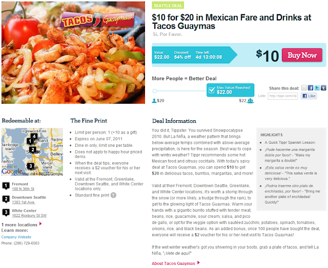
Before I explain, let's do a little mental exercise. If you've already closed the previous post or haven't opened it yet, open it up in a new tab/window and take a good look at the first picture of the Tacos Guaymas deal. Now imagine that you are buying it. What are you getting? What are you expecting to be delivered to you? How are you expecting to be able to use it?

Now look at this image of the resulting voucher download link:

So far so good, right? When you click on the (partially redacted and kind of hard to find even when it isn't) vouchers link, what do you expect to get? Really think about it: when you print this thing out, what's it going to look like? Get a picture in your head. Got it?


...


Was this it?

Probably not, right? I know I was surprised. I was fully expecting to get one voucher for $22. Neither the page selling the deal, the email receipt of the deal, the email informing me the voucher was ready, nor the voucher preview page at all prepared me for the fact that I'd be getting one voucher for $20 and one voucher for $2, which is quite a bit less useful than one for $22 and, by the way, can't be used together. Plus, now that I know the original deal value and the difference between that and the "tipped" value are issued as separate vouchers, withholding the original $20 voucher for 5 days makes absolutely no sense at all.

I believe this to be a purposeful bait-and-switch (there are many more grievous examples of the bait-and-switch dark pattern, but this still qualifies.) Why didn't they tell people right up front they'd be getting two coupons? I suspect it's because they thought fewer people would buy it if they knew it was split up that way - and they're probably right.

As a guy who believes in math and statistics, I try not to shirk a business just because I've had a bad experience. One bad experience doesn't necessarily mean that every experience will be bad, after all. But I I'm done with Tippr, especially since Groupon and LivingSocial offer deals that are just as good and don't pull this kind of stuff. The sad part is, the actual deal is really great, and even the way they decided to split up the coupons isn't really that big a deal. The big deal is that they misled me every step of the way: before I laid money down, there was no indication that I'd have to wait 5 days to use what I bought; after I realized I had to wait, there was no way to back out and get my money back; and there was no way for me to have anticipated what it was they were eventually going to give me. All of that just makes me completely unwilling to trust them with my money again. So, goodbye, Tippr. I hardly knew ye.

P.S. Hah. I can't delete my account. I can't even zero out most of the personal information. Awesome. I can unsubscribe from the email deals, but that's about it. Brb, I have to go wash the sleeze off my hands now.

Sunday, December 5, 2010

Facebook's New Profile

Facebook, as I'm sure many of you have heard, is in the process of rolling out it's new profile design. Before I talk about some of the things I feel they got wrong - some of which are incredibly obvious, unfortunately - I'll give credit where credit is due and discuss what I like about it. One thing I will definitely credit them for is not making it radical a departure from the old design. It's an adjustment, but not a huge one, which should greatly lessen the amount shell shock (and whining) when the rest of the 500 million are eventually force-fed the change.

Another thing I like is the "Your Friendship" section they've added in the upper right. What it looks like greatly depends on the two people in question, but here's one of the better examples I've found with one of my friends:

This looks much like one might expect. If you did a Venn diagram with one circle being the data that Facebook has about me and the other the data Facebook has about my friend, what you're seeing is a formatted representation of (some of) the overlap. It's really about time Facebook added this, as there have been a plethora of 3rd party applications all attempting to present this information to people with varying degrees of terribleness. (Perhaps some aren't that bad, but none of the ones I've seen ended up being terribly compelling.) I especially like that Facebook tries to include some timely data here, like the next event you can expect to see each other at. All of it is potential conversation fodder, which I kind of like, and will no doubt be a useful way for all those as-yet-silent profile stalkers to get their foot in the door [/tongue-firmly-in-cheek].

My only complaint about that particular piece is that their choice of formatting is a little odd for a person of Western culture (aka: me and likely all of you reading this). Since we read left-to-right, top-to-bottom, I think that the descriptions of what those pictures are would be better placed above them instead of below them. That way the most-probable interaction goes more like: "Photos of me and my friend... and there they are," instead of "What are these photos of? Oh, me and my friend." It's not a big deal as long as most people figure it out as quickly as I did, but I still feel it's worth a mention.

The new profile header, however, needs quite a bit of work. Here's mine:
Ugh.
Let's start with the demographic info. It used to be thrown in the left-hand margin and is now front-and-center:
Is this a good placement? I don't know. I can think of arguments both for and against, but I don't personally mind it. What I do know is that this is the laziest possible way to format that information and, as a result, is totally self defeating. I mean, I have to assume moving it from halfway down the left-hand margin to front-and-center on the profile page is a deliberate attempt to make the information more visible on the page. In which case, presenting it as a Block-O-Text really defeats the point. 2 steps forward, 2 steps back. Don't believe me? Check out how much easier that info is to read if I format it like this (I removed the formatting options to show you what it'd look like to anyone but me):
Ahhhhhh
The other huge problem is the seemingly-random, computer-selected group of photos immediately beneath the demographics. Seriously, Facebook, how often have you had egg on your face over accidentally showing the wrong photo at the wrong time? If you cut the user out of this selection process and just decide for them, you're bound to piss someone off - and with 500 million users, you're bound to piss off the equivalent of a small country. Case in point, the 2nd photo from the right is a photo of me and an ex-girlfriend.
Awk... ward.
Luckily for Facebook, I'm purposely exaggerating the issue to illustrate a point - she and I are still really good friends and I actually don't mind that picture showing up there at all - but take any random person and surprise them with a front-and-center photo of them and any random ex and they are very likely to be very unhappy. Facebook even has all the information they need to specifically avoid choosing this picture, they apparently just didn't think of it.

Attention Facebook: photos are very personal; a user should be allowed to be as involved in this process as they'd like and you should default to making this process completely inclusive. It's really not that hard to do. Simply present a screen full of photos and let them pick the 5 they want - allowing them to page through multiple screens if they wish - and include options to defer the activity for later or to let you do it for them. This is the most delicate and respectful way to do this and it took me about 5 seconds to come up with.

Photos were your bread-and-butter for a long time - your raison d'etre - and are still a big part of your user experience. It's just plain sad that you still don't know how to handle this stuff. For instance, some people are extremely sensitive about photos and might prefer to have as few photos as possible on their main page, but it's impossible for those users to show no photos at all (at least without jumping through a lot of hoops and making said users extremely hateful in the process). You can remove a photo if you don't want it there, but you still don't get any say in the photo Facebook chooses to replace it.

And so, with its latest update, Facebook continues to be like the proverbial hamster in the wheel: always moving forward, but never really getting anywhere.

Saturday, December 4, 2010

All About the New Job at Zaaz

This is an informational post for all those friends and family of mine that have shown interest about the new position I just attained.

It's at a nifty company called Zaaz. They're a software design agency, specializing on rich, interactive experiences (click the little "Open" button above the search bar for their sales pitch). They work predominantly on websites for clients, but also dabble other in things (like mobile apps) from time to time.

I got hired on as a quality assurance tester - it's kind of like the job I had at Microsoft, but muss less rigid, with a culture that suits me better, and with a lot less emphasis on programming and automation (which makes me very happy). They also seem keen on allowing me to occasionally help out in other disciplines as needed, allowing me to get tiny nuggets of UX and client-side web dev experience over time. Oh, and my round-trip commute will be about 10 minutes. I live, like, 6 blocks away.

On the downside, technically I'm not actually working for Zaaz just yet. I got the job through a recruiting agency called CampusPoint (whose website could use a little of Zaaz's expertise, incidently) and the position is a "Contract2Career" position. Basically that means that CampusPoint is actually the one paying me for a as-yet-undefined probationary period and they offer absolutely no fringe benefits. No healthcare, no 401k, not even a bus pass; all I get is a paycheck and shit to do. Still, it's better than unemployment, and if I can manage to work an hour or two of overtime a week (which is highly likely at a tech firm) that'll help offset my healthcare coverage at least.

Testing isn't exactly what I'm aiming for, but testing roles are not all the same, and this one seems to be a better fit for a UX-driven person than the one at Microsoft was. We'll see how it goes, but for now I'm optimistic. :)

Thursday, December 2, 2010

Examining the New York Times Paywall

I recently watched The Soloist - and enjoyed it, wonderful film - and it got me (re)thinking about the state of the journalism profession in today's information-enabled world. I was once all for tearing down the walled gardens of the news media (and confess that I still find that to be a beautiful idea in a certain light) but the now older and wiser me realizes that it's really important that a profession wherein people are payed to investigate, to dig up the truth at any cost, and to report those findings dispassionately is one worth keeping around. I really wish money could stay out of the equation altogether since, after all, what the public is willing to buy isn't always what qualifies as good journalism, but it's the system of reward that we've decided for ourselves, so I guess I have to work with it.

Don't get me wrong - blogs and bloggers are great (if I do say so myself) and I get a lot of information from them but, by and large, it's almost impossible for someone to be a professional blogger. There are stories I've wanted to write, but never will just because they require more effort than I'm willing to put in to do them justice without some kind of payoff. You need absurd amounts of traffic to get the amount of click-throughs necessary to generate even a modest income. I mean, just ask the New York Times. They get more traffic than any blog will ever get some 200M pageviews every month, but they'd need something like 1.3B/mo in order to stay solvent in the long term while still keeping their paper free (source). (Granted they have way more overhead than a blog does, but you see my point.)

So I'm softly in favor of paywalls because of the people-should-get-paid-for-a-job-well-done thing, and also because of something my friend Ray said on Facebook a bit ago: "If you are getting a service for free you're not the consumer, you're the product being sold." Digging into that is an entire other post, I think, but doesn't that idea skeeve you out just a little bit? [/shudders]

Anyway, speaking of paywalls and the New York Times, I'm sure everyone knows that they're going to be putting up a paywall starting next year. I also found some discussions about the proposed New York Times paywall wherein they are divining what the structure might look like from some of the surveys the Times has commissioned. I don't have access to their user data or their research - in fact all I have access to is my own common sense and some random stuff I can find on Google - but I'm not entirely convinced that their model is going to work, at least not for the industry as a whole.

Clearly, the Times is going to see a drop in readership, and they're expecting that. They're hoping what virtually every other news organization watching this experiment is hoping: that a smaller group of subscribers will generate more revenue than a larger group of ad-supported readers. They have smartly recognized that reader behavior is complicated. For instance, there are people that read them regularly, who go out of their way to visit the New York Times site independently, and then there are people that find New York Times articles by happenstance, via blog links and Twitter posts and Facebook statuses, etc. (There's also a squishy middle I realize, but, since I don't have any real data to work with, I hope you'll allow me the conceit of ignoring them for the purposes of this discussion.)

In recognition of these two groups, they have decided on a preferential access system. Subscribers get unlimited access for a nominal fee (as yet undecided upon), and occasional readers will get limited access. This neatly keeps the same two groups in the same two piles; most of the regulars will convert to subscribers (they hope) and the ones that don't will likely become occasional readers. Some of both groups will probably ditch completely, but I would think that anyone who reads them on a "regular" basis must enjoy/need the content and so would gladly take the crumbs if they can't get the cookie.

At our currently 30,000 foot view, this design makes a lot of sense. However, as it so often is, the devil is in the details. It seems like they're going to make every user create a username, regardless of frequency of use. Well, I don't have to speculate anymore, the paywall went up as I was writing this post (which is kind of spooky). I'm not sure if they're actually taking money yet, but there's definitely a login barrier, so they are going with usernames for everybody. Look for yourself:

Frankly, I think they chose the worst possible option. The majority of the occasional users, the users who only show up because they got linked over to it, are probably going to turn right back around and go home at this point. Some will grin and bear it if they really really wanted to read that article, or if they have the foresight to realize that they may want to read more articles at some point in the future, but I'm betting that most won't. It seems like they're trying to get people to create accounts first and then later they'll dole out the payment structure (I didn't see any payment options when I clicked through to the account creation pages), which says to me that someone there seems to understand this user behavior and is attempting to mitigate it by phasing in the paywall. But there are two options I can think of that are better than this:

  1. Use of federated login systems. Facebook, Twitter, OpenID, etc. are all incredibly popular and successful examples. If they login page allowed you to sign up with any of those, that would simply be a one-time extra hurdle that I think a lot more people would be likely to jump.
  2. Target information gatekeepers. This is something I thought up on the bus today. In short, the Times (or whatever entity) could create their own URL shortening service - say, nyt.ms, for example. Subscribers would get full access to all articles no matter how they were accessed, and they would be able to share the articles with friends via a convenient sharing button on every article that would create the special shortened link (which could be wrapped in another if need be). Non-subscribers would only get access via these shortened urls and would see standard ad-supported pages. The sessions would time-out after xx minutes and wouldn't allow the same IP/MAC address to use the same link twice in the same xx period of time in order to discourage gaming the system. Suddenly all those self-professed social media gurus actually have a way to get all that power they claim to have (in their own minds, anyway) and will likely pay a fairly good fee to get that privilege. All everyone else has to do is follow them on Twitter or Facebook or subscribe to their blog, which they're probably doing already if said people really are Connectors or Mavens. This system mimics the way the paper works in real life. Someone buys it, reads it, then leaves it in the coffee shop for someone else to pick up and read later. (Note: mimicking real life with digital technology isn't always a good idea, so this may actually work realllllly terribly, but it sounds good in my head.)
We'll see how the paywall pans out, but I'm not convinced that it will as it's currently implemented.

The Tippr Backstab

Tippr, like it's compatriots Groupon and LivingSocial, offers insanely good deals on local stuff. This morning, I get this deal in my inbox:
I think to myself "Oh, nice - they have one in Fremont and I'm going there today to have lunch with friends. How perfect is this?"

So I buy it, thinking that my friend and I will eat like kings for $5 each. After I buy it, I go into the "My Account" section of the website to print out the deal. This is what I see:
Pending?!
Pending. For how long? I'm not sure. I'm hoping not that long because I'm hoping to use the thing in about 90 minutes. I check for the confirmation email and here's what it says:
Hi Dustin,
Thank you for purchasing this great deal from Tacos Guaymas.
Your credit card ([redacted]) will be charged within 24 hours of the offer ending (Monday, December 06 2010), at which time you will receive another email notifying you that your voucher is ready. When you receive that email, simply click on the provided link, go to the "My Account" section of our website, and then click on the voucher number to print it. Remember to take your voucher with you when you visit Tacos Guaymas.
I take great pains not to "bash" when I do these little UX reviews, because I know people work hard on this stuff and sometimes you can't get it all right, but... fuck you, Tippr. The deal I thought I was buying and using today won't actually be ready to use until Tuesday? That's bullshit. Want to know what's even more bullshit? Now that I know what's going on, I don't want the deal. I want to cancel. I don't actually have the deal - and I haven't actually been charged any money yet - so canceling should be easy, right? Do you see a cancel button up there? Nope. You don't. So I've managed to buy something I didn't want, and there's no way for me to correct it (short of calling and yelling at someone).

I went back and re-read all the text on the deal page (the first image up there)  - which no sane user can ever be expected to do, btw - and it says I have 4 days left to still buy this deal but there is nothing - nothing - that says the deal won't be available to use until after the sale closes. I only get told that on the back end of the deal, after I've already ponied up. This is dangerously close to a dark pattern and is really not a very polite thing to do to users.

At this point, someone from Tippr reading this (which will probably happen - companies tend to find this inconsequential little blog somehow) is probably about to spout off some excuse about how I just don't understand how their system works. First of all: yes, that's my point. I wasn't able to discern what would happen before it did happen. It's your job to make sure that I can. Second of all, now that I've been slapped, my eyes are open: because the savings is dependent on how many people buy the deal - whether the deal "tips", as you say - you don't issue the voucher until the deal is closed. But here's the thing (as you all can clearly see in the screengrab up there): it's already tipped. It's done. You can now safely issue the vouchers. But, of course, you won't.

What makes me particularly pissed about this is that I also happened to buy a Groupon today. Check it out:

And would you look at that. I can use it right now. Today - the instant I bought it, in fact. That's exactly what I expected, because that's how eCommerce is expected to work. It's ok if it sometimes doesn't work like that - like, say, when Amazon has to ship something to you - but that expectation needs to be made crystal clear and in advance of the transaction.

I won't say I'll never use Tippr again - they do have good deals - but I really wish there was another way for me to learn that lesson.

Wednesday, December 1, 2010

Who's Responsible?

Tonight I went to a gathering at Town Hall Seattle entitled "What the State Won't Tell you About the Deep Bore Tunnel," sponsored by The Stranger. All sorts of interesting things and topics were discussed there. The Seattle Channel will soon host the video of the ~90 minute session and I invite you to take it in at your leisure and come to your own conclusions about what was said there if you are so inclined. (As an aside, if you aren't from Seattle or otherwise have no idea what I'm talking about, here's a great series by the so-well-informed-there-is-cause-for-concern Eric de Place cataloging and examining Seattle's decade-long argument over what to do with our waterfront.)

During the public question-and-answer period, immediately following Dominic Holden playing devil's advocate to a panel of tunnel opponents, a lady got up to the mic. As often occurs amongst people brave enough to ask questions in public forums like this, she gave a long, rambling, comment/question hybrid (quomment? cestion?) that was a tour de force of social justice issues. One thing she said stood out to me - and it probably wasn't one of the things she wanted to stand out. At one point she was talking about her commute, making either a cars-are-still-necessary argument (which no one on the panel argued against - in fact both Mayor McGinn and Councilmember O'Brien said as much) or a transit-is-not-sufficient argument (which everyone on the panel would agree with), when she said that she lived in Ballard and worked in Rainier Valley. (Note: links are to map points so those unfamiliar with Seattle's geography can see where those places are.)


In a discussion like this, a lot is said about the responsibility of various governments and authorities and leaders - and rightly so. Who's accountable for what, what process was taken to get to these results, what process should have been taken, where do we go from here, etc., etc. All good points. All worth talking about. But where does personal responsibility come in? That seemed to be absent from the discussion tonight. I don't mean to slander this lady - she seemed nice enough, and I'll give her the benefit of the doubt as far as her personal choices go so as to not judge what I don't know - but her work and her home are awfully far apart; I wonder if she's at all considered doing something about that?

Does Seattle have a responsibility to make it possible to commute from Ballard to Rainier Valley? Yes. Both of those places are within city limits and, if only from a social justice standpoint, I firmly believe that the city has the responsibility to do everything in it's power to allow every citizen to be able to travel from any one point in the city to any other, including those who are precluded from being able to operate an automobile. I would hope such thinking is common sense.

Is everyone who lives far from where they work, or other places they go frequently, irresponsible? No. Quite frankly, some people just don't have a lot of options - especially the poor, the elderly, and the disabled - and I'm not about to begrudge them doing what they need to do to make ends meet.

Those two points made, I also firmly believe that if we as individuals are going to make demands of our government, or any system for that matter; if we as individuals are going to expect a system to tend to our needs; if we intend to hold said system accountable for failing to attend to those needs; then we as individuals have a responsibility to hold ourselves accountable for the burdens we place on that system and to constantly evaluate whether we can safely and comfortably lessen that burden. It seems only fair, especially since others must also rely on that system for their needs, and you would hope that they were doing the same for you.

UX Quickie: You Want Me to Buy What, Now?

I got an email today from Calendars.com. I bought a few calendars from them last year, so they're helpfully suggesting I restock now that the year has ended. That makes sense, and I'll probably even eat that piece of bacn in the next few days. But I have to share with you the things they're "recommending just for me:"
o_0
First thought: "Outhouse calendars? These exist? And people buy them?"

Second thought: "The person who would buy all 3 of these calendars is probably... very interesting."

Third, panicked, thought: "... oh, shit, they think that I'm that interesting! Gah!"

Want to know what calendars I bought last year? Scenic Pacific Northwest, space photos, Obama quotes, Word-of-the-Day, and one with editorial cartoons. So clearly I like outhouses. And burlesque. And skiing. All at once. In fact, if they have calendars of burlesque dancers using outhouses in the snow whilst wearing ski goggles, I'll take seven.

Lesson: Recommendation systems need data - lots of it - from both the specific customer you're serving and from a large database of other customers. If you don't have that, don't bother, because bad recommendations - especially when they're so obviously, laughably bad - are worse than none at all.

Tunesday, Vol XI: Cave In, Pseudosix, A Fine Frenzy, more

Monday, November 29, 2010

Project SoundBoard

My dad and I have this tradition whenever we hang out: we each choose a couple of albums that we love, and we just put them on. We sit, listen, analyze, compare. It's a lot of fun for us but probably no one else. I mean, seriously, who does nothing but hang out and listen to music? Still, this is something I've wanted to do with some friends for a long time. So last night I came up with an idea that would allow me to have my cake and eat it, too. I know there are friends of mine who love music, so I thought of a way to do this that could be fun for everyone.

I figured that this would work best if I combined it with another activity, since I'd probably have more luck inviting 10 people to a ritual killing than to sit in silence in my living room for hours on end. Board games seemed like an obvious choice, hence the name Project SoundBoard (if you're *facepalm*-ing, then I've done my job correctly).

Basically the idea is people would come over on a biweekly basis and bring food/booze/games and, of course, music. Specifically, they'd bring over an album that they really loved and wanted to share with people. Albums would get played in a random order, with preference being given to those who didn't get to play something the previous meeting. We'd keep going until people got bored and wanted to go home. Good music, good games, good people. Not a bad idea, no?

I field tested it with a small group of friends whom I felt would be more likely to be into such a thing, but unfortunately it has so far drawn more crickets than participants. But there has to be someone I know that's interested in this kind of thing. I mean, I'm not that weird, am I? (... Don't answer that.)

Sunday, November 28, 2010

On Questioning Authority

Being an armchair quarterback is, at the very least, an American tradition if not irrevocably part of the human condition itself. It's really easy to question the actions of someone in charge - be it the President, a Senator, a Mayor, your boss, etc - and to say what you would've done differently. We all do it. Myself included. And why not? We (presumably) have most, if not all, of the same facts at our disposal. If we can see the solution, why can't they?

Yesterday, I was thinking of one of the pearls of wisdom that Bill Adama (from the re-imagined Battlestar Galactica) sometimes produces (usually as if it's by accident), and I couldn't help but think of another. I'm sure many of my readers (all 12 of you) know the show but those who don't may need a little context; I'll try not to give too much away. At one point in the series Adama is no longer in command of the Galactica and his XO takes command of the fleet. Under his command... well, let's just say things don't go so well. One of the reasons is his wife, concerned mainly with herself and her own social status, keeps manipulating him, second-guessing any decision that might make him (and her) look "weak." She is doing exactly that during a conversation with her husband when Adama unexpectedly walks into the room, interrupting them, unintentionally eavesdropping on the meat of the conversation.

After she excuses herself, Adama says to his XO: "Never had much use for people who second-guessed my decisions. Especially if they've never held a command. They don't understand the pressure."

I believe in Timothy Leary's mantra "Think for yourself; question authority." I think it's everyone's duty to do so. Many leaders - the good ones, in my opinion - even welcome it. But we should remember that we often lack context - of the situation, of experiences, of knowledge, etc. As a result, when we question authority I believe we should default to doing so with respect. Just try to remember: if authority can be wrong, then so can you.

Wednesday, November 24, 2010

UX Quickie: Toggle Consistency

This is something I see all the time, most commonly in Android application menus and video games (anecdotally speaking). When there are several buttons/switches that toggle things on/off, they are often done inconsistently. Here's an example from the otherwise fantastic Dragon Age: Origins to demonstrate what I mean:


These two toggle buttons are in the upper left of the HUD, right under the icons for each character in the party. As one would expect from their placement, they allow you quick access to party-wide commands. The one on the left lets you toggle back and forth between "Select All" and "Select One" and the on on the right lets you toggle back and forth between "Move Freely" and "Hold Position." If you play RPGs or strategy games you'll likely immediately see the utility of these however, every time I come back to the game after a long time off, they always confuse me. Here's why:

  1. The "Select All/One" button's icon indicates the result of the action; it attempts to communicate what will happen when the button is clicked.
  2. The "Move Freely/Hold Position" button's icon indicates the current state; it attempts to communicate what is happening now.
Can you see why that can get confusing? Two toggle switches right next to each other, both of which toggle back and forth between only two options, but are difficult to figure out because their feedback methods are perfectly out of phase, resulting in cognitive dissonance.

If you're building toggle commands into your website/software, double check that the feedback/communication is consistent. Which method is best? That's hard to say. When in doubt, do some user testing. Honestly the method you use - whether it's one of the above or something else you've come up with - matters a lot less than making your method consistent because, even if it's confusing at first, the across-the-board consistency means people only have to figure it out once. 

Monday, November 22, 2010

Song of the Moment: "Hide and Seek"


"Hide and Seek" by Imogen Heap, found on Speak for Yourself

I tend to be a real sucker for layered vocal harmonies. It follows, then, that somber, moody, A Capella pieces tend to produce some of my favorite musical moments. The end of The Canyon Behind Her by dredg and A Perfect Circle's cover of Fiddle and the Drum are two of my very favorite examples, along with this masterpiece by Imogen Heap.

The layered vocals, the dynamics, the deliberate morphing of her voice into sounding ever-so-slightly like an instrument... oooh, sheer heaven. This song makes me want to grab a good good, hop in the tub, and just play it on repeat for about an hour.

Wtf Metro

Miss Cranky Pants over a Publicola is right to lambaste the county for pulling real-time bus info out from under anxious bus riders on this unusually snowy day in the Pacific Northwest. Seriously, Metro, that was just plain bone-headed. You've clearly planned ahead for this storm much better than you did for Snowpocalypse 2008, I'll grant you that, but you've clearly not correctly anticipated the needs of your riders, which is arguably your first priority.

It really wasn't that hard to do this right. You add and remove routes from your database all the time, and clearly OneBusAway already anticipates this. Would adding snow routes to that database and letting things continue as usual really have been that hard? I mean, you've only had 2 years.

I've Got a Blank Spot

Some time ago I bought a black 16"x16" picture frame for a poster that I thought was 16"x16" but actually turned out to be 17"x17". However, I decided to keep the frame because I liked it and because I didn't think it would be that hard to find a poster to fit it somewhere down the line.

Truth be told, it had just sat in my closet for a long time and I'd completely forgotten about it. Now that I've just moved to a new place - and one with less closet space - this empty frame has become more apparent. It just sits on the floor, leaning against the wall, all day, every day, blank, empty, alone, staring at me, wondering why I don't love it.

Today I finally decided to do something about it. Any project manager/usability professional worth their salt can write a pretty good use case/scenario around this particular need, because my needs and goals are extremely well-defined here. Hell, my information need/goal is so well-defined, I doubt if anyone reading this, irrespective of profession, would be surprised at the information seeking behavior that results from my problem: I need to browse 16"x16" posters so I can choose one I wouldn't mind framing and putting on my wall.

In other words, whether by searching or browsing, I need to first restrict the subset of posters on a site to the ones that are exactly 16"x16" and then use my usual human fuzzy logic to browse through and pick one I like. Simple, right? So simple, in fact, that it's not actually possible to do on any of the major online poster stores.

Go ahead and try. A Google search for "posters" will yield the following stores on the first page of results:


None of them support the kind of information seeking behavior I'm talking about. I grant you that trying to find posters to fit a specific frame can be dismissed as an edge case, an idiosyncrasy that perhaps wouldn't be in the "80% case." But is it so crazy to think that people would want to be able to browse by size? Or at least sort search results by size? Is it really so rare for people to look at a blank spot on their wall and think "I'd like a poster that'll fit right there" and then go out in search for one that'll fit the space? Common sense tells me it isn't (but hey, I've been wrong before).

Two of the sites seem to offer this ability but then soon reveal themselves to be false prophets. Here's the homepage for IcePoster:
Hey, baby, you're just what I've been looking for...
Ignoring for the moment that this site seems to deal exclusively in celebrity posters, thus limiting my choices more than I'd like, at first glance that top banner seems to suggest that you can get most posters on the site in a variety of sizes. That seems like a pretty good start. So I click on a couple of the names featured on the front page, and the sorting options for all of them are the same:
... damn beer goggles.
As it turns out, this site isn't going to help me out, either, as it doesn't quite seem to offer all the options its homepage originally promised. I will give it some props for giving customers a choice on poster sizes for pretty much everything they sell, however. That choice at least attempts to solve the "choosing by size" problem by making size not matter - "you can choose any poster you want, and chances are we can give you a size that'll fit the space you're thinking of."

BareWalls comes so close to allowing the kind of information seeking behavior that I'm talking about that its failure to deliver makes it so much more frustrating. I noticed that BareWalls is the only service to have a little "Advance Search" option on their search engine. I clicked it and almost shouted in glee when I saw the resulting page:
Sweet!
Look at that! I can narrow both width and height to exactly what I need! And I can even specify a price range, something I honestly hadn't quite thought of until I saw it but turns out to also be kind of an important consideration. So I fill in the fields:
Narrowing my seaaaarch, la di daaaa
And I hit "Search":
ET TU?!
There are two reasons why that result is really, really bad UX:
  1. The user (me, in this case) had no idea this was required. If a field needs to be filled in before a search can work, they need to tell users in advance. I'm actually really surprised I even have to mention this since this is like, web forms 101. 
  2. It just doesn't make any sense. Why do they need a keyword? In the context of my information need, a keyword isn't important to me, so why is it important to them? Seriously, it's easy enough to get a database to return all the relevant rows based on my search sans a keyword that I can't think of any reason why they'd flat-out require this for every advanced search.
Oh, well. I guess finding this poster will take more work than I thought.

Monday, November 15, 2010

Facebook Events Upgrade Needed

Today the Twitterverse and Bloggospher are abuzz with news about Facebook Mail. It sounds... interesting. But, after reading about it, I don't "get it." Maybe I'm not supposed to? I guess I'd just rather they be spending time fixing Facebook Events.

Don't get me wrong, I love Facebook Events - it's pretty much the easiest way I know to invite people to things. Pretty much everyone I know is on there, I can add people to the event by browsing/searching for names rather than trying to remember email addresses, co-hosting is easy since I can add someone else as an admin, and I can push the events calendar feed to my Google Calendar so the events have some context. That said, there are some really obvious features that are missing:

  • Conflicts - When I get a new event invite, Facebook will display it to me on the homepage. What it won't do is tell me if said event conflicts with other events. This should be something that's really easy to do and is sorely needed because the context of "what else is going on that day" is usually pretty important when figuring out how you respond.
  • Scheduling - I'm planning a housewarming party in my new place, and the first day I picked just happened to be a day that no one could come. Event planning this way is often a crapshoot. Wouldn't it be nice if Facebook helped you pick dates based on availability? I mean, I realize this would be limited, but it'd at least give you something to work with.
  • Reminders - Self-explanatory and a no-brainer. Pretty much every calendaring system worth it's salt has some kind of reminder feature and I'm constantly perplexed at it's absence here. I can't even get around this using the version of the event in my Google Calendar, because if someone marks the event "private" (which happens a lot) Google can't actually access any details or metadata and therefore can't decorate it with it's own.
  • Nagging - I used to run a group on Meetup.com and one of the features I really loved was being able to automagically nag the maybes and not-yet-respondeds. Just once, of course - there's a fine line between reminding people to commit and being an ass sometimes. But this is very necessary for all kinds of reasons. The first is that people often procrastinate and for whatever reason don't respond to the event right away. (I do this all the time.) The second is that if an event organizer is trying to figure out how much space/food/drink/Rockband copies are needed, these people will be especially interested in letting the stragglers know that they need to shit or get off the pot.
  • Integration - Imagine if you could manage and respond to Facebook Events directly from the comfort of Outlook, iCal, Google Calendar, or whatever it is you use to manage your daily life. Hell, I'd be happy if they'd just realize the account I'm using to pull data into my Google Calendar is the same email as my Facebook account so that Google can show Facebook events as something other than "busy."
[/rant] :)

Wednesday, November 10, 2010

Creating Strong, Usable Passwords

Ah, passwords. Every system admin hates weak passwords, and every user hates having to remember 35 million strong passwords in their heads for every tiny little website that they use, and never the twain shall meet. Or will they?

I've got a lovely little system that ensures I have a strong, unique password for every website/service I use, but almost never forget a password.

Full disclosure: most of these ideas probably aren't mine. I'm sure I've compiled this system from a lot of people I've talked to and things I've read over the years. I've just been using it so long that I don't quite remember how the hell I came up with it. But I'm gonna share it all with you just the same.

The secret is to keep some knowledge in your head and some knowledge in the world, allowing you to lessen your cognitive load. Instead of remembering a bunch of passwords, you're basically going to remember a formula for deriving your passwords. The basic formula is like this:

[remembered passphrase] + [connector] + [service-specific abbreviation]

Here's how to do it:

1. Create Your Passphrase
It's cleverly called a passphrase as opposed to a password because it's a single, made up word generated from a phrase as opposed to a real word slightly jumbled. It's a bit safer as someone attempting a dictionary-based attack will have a harder time guessing the passphrase.

Doing this is pretty simple. Just write down a phrase that's relatively easy to remember. Perhaps it's a favorite quote, or about a summer you spent in France. It really can be anything that you're fairly confident wouldn't be hard for you to recall (and, if at all possible, wouldn't be something people would easily associate with you). For instance, let's say you choose the now-famous Spiderman quote "With great power comes great responsibility."

Now that you have your phrase, represent each word with a character (or series of characters) and eliminate the spaces. A very simple way to encode the above phrase would be:

wgpcgr

This isn't a word in any dictionary, so you're already ahead of the curve if you stop right there. But, if you can, try and make it a little more complicated. A good strong passphrase will have at least one of each of the following:
  • an uppercase character
  • a lowercase character
  • a "special" character
  • a number

Using a leet alphabet you can easily translate letters to numbers or special characters. Here's another pass at translating the phrase "With great power comes great responsibility", but applying the guidelines above:

wGPwRc(4

In addition, I shortened "power" to "pwr" instead of just "p" to make the passphrase a bit longer. Shoot for somewhere between 6-8 characters for this phrase since 8 characters is about as long as you can be reasonably expected to remember (also some archaic systems - most notoriously university systems - still have the "type a password between 6-8 characters" limitation, and in those cases you can simply use the passphrase instead of the full password system we're generating here).

2. Create a Connector
The connector is the thing you use to bridge your passphrase with the abbreviation (discussed in the next section) to create your full password. This can be as simple as a dash ("-") or a plus sign ("+") or whatever you want. Have fun with it. It's just got to be a  character (or series of characters) you can remember. If you're stressing out about this, I'd highly recommend just going simple, as the end result of this process will be a very strong password no matter what you choose here.

For our running example, I'll choose something relatively simple to be our connector, the dash

-

3. Thinking up Abbreviations
The last part of this is to think up a prefix/suffix to your passphrase that's based on the site or service you're using. It doesn't need to be complicated. it just needs to be something that is strongly associated with the service and something you can remember. Go with the first thing you think of. As a simple, example, let's say your email password prefix/suffix is "em", or "@" if you're feeling clever. Again, the key to here is the ability to keep this knowledge in the world - it should be immediately recallable when you're sitting at that website and about to type in your password.

Our running example will use the example of an email password, using the abbreviation:

em

4. Putting it All Together
Alright! You've got your passphrase, you've got your connector, and you've got a service-specific abbreviation. To put it together, you've got a few options. You can use your abbreviation as a suffix:

passphrase + connector + abbreviation

a prefix:

abbreviation + connector + passphrase

or you can use both in some creative ways. Here's a few ideas:

abbreviation + connector + passphrase + connector + abbreviation
1st half of abbr + conn + pass + conn + 2nd half of abbr

Let's make this concrete. Remember, our encoded passphrase is wGPwRc(4, our connector is -, and our abbreviation for our email program is em

Here are the possible passwords that result from the formulas above.
  • Suffix formula: wGPwRc(4-em
  • Prefix formula: em-wGPwRc(4
  • Prefix and suffix formula: em-wGPwRc(4-em
  • Half-and-half formula: e-wGPwRc(4-m

Just make sure you pick one formula and stick with it. If you keep switching the formula, it'll just be self defeating. See? Using this method you can have your cake and eat it too. And I'm ending this blog post here because now I want cake.

Tuesday, November 9, 2010

Netflummuxed

This is Netflix's current home page.
Digital crack.
See the problem? No? How about now:

Netflix streaming is down. Has been for a good 30-45 mins from what I can tell from the Twitter stream.  They know about the issue, they're working on it, but they're not alerting the many, many, MANY of their customers that still don't know about this yet through the one place you can almost guarantee all of them will go: their website.

To ensure good UX, you can't just design it and then walk away. You need to make sure you have the systems in place to respond to unanticipated events. You don't have to fix it before anyone notices or even be able to anticipate every event ... you just need to expect the unexpected and be amongst the first to alert your audience when it happens.

Tunesday, Vol VIII: Dry Kill Logic, Head Like a Kite, A Fine Frenzy, more

Rent!

I recently moved into a new place (which explains my blogging absence - sorry about that everyone), and that obviously implies lots and lots of changes. One change in particular has inspired a UX-related post: changing who I pay rent to. I find this to be an interesting UX story because it's not simply about me interacting with a machine, it involves me interacting with both a machine and a person. A lot of people building software don't think about the fact customer service can factor into a user's experience, but it most certainly can.

Aside: Before I begin this review/critique, I'd like to first mention that Verity Credit Union is an excellent bank and that my experience in this case is not typical of the general experience I have had with them over the past few years. In fact, if you're looking to change banks (and if you're not already with a credit union I'm not sure why you wouldn't be), I highly recommend you consider allowing Verity to safeguard and manage your money.

In the past two places I lived, I used Verity's bill pay service to automatically schedule my payments to my landlord. Each month on the 1st they'd get wired the appropriate amount of money directly from my account to theirs. It was pretty sweet; they always got their rent on time, and I never really had to think about it.

The new apartment building I moved into isn't set up to make those kinds of transactions, but the rental agent/receptionist on staff told me that setting up something similar that worked via snail mail instead shouldn't be that hard. I don't have any checks (I haven't written one in like, 3 years) and I don't want to have to bike up to Wallingford just to pay rent every month, so this sounded good. I go to my credit union's website and I try to make another Payee like usual:


There seems to be only one form available, which is kind of confusing because things like "Name on Account" and "Account #" aren't necessary if they're just mailing a check to someone. I try moving forward just leaving it blank, but the form won't let me. I use their in-system email service to shoot them a message and ask how to set up a snail mail version of paying bills. The message I got back almost literally sounded like they were talking to a 5 year old. Here's a snippet:
1. Click on the "payees" link under the "payments" tab. 

2. Please choose  "An Individual" - If the payee you wish to add is an individual (e.g. friend, family member, etc.), select the "An Individual" radio button and then click the "continue button." 
Now, I've worked a help desk before and I know exactly why they do this: they cater to the least common denominator so that they can be certain that they're understood no matter who's on the other end. But just because I understand it doesn't mean I don't hate it and find it mildly insulting. I mean, people just don't talk to  each other like that in every day conversation. Imagine your friend dragged you to a party at a stranger's house and you asked the host where the wine glasses were. How would you react if instead of him just telling you "cabinet left of the sink" he also gave you detailed instructions about how to open said cabinet just in case you hadn't run across that technology before? Right, you'd think he was being condescending (and you then may or may not be planning on how to make sure the contents of your wine glass "accidentally" end up on his carpet).

I don't blame whomever it was that sent me that email. They were probably instructed to talk like that. But it's ridiculous to treat every single user who asks a question like a n00b every single time. Because then you're Clippy. And you don't want to be Clippy.

Go away. No one likes you.
In this case, had the technician done a little homework, they would've seen that I've created 5-6 payees before, and have scheduled many payments, both single payments and recurring. I may not be an expert, but I know my way around the block. It would've been nice to be treated as such.

Anyway, back to my issue: paying bills via snail mail. The technician did answer the question - and the answer is kind of hilarious.
You can input your name or address in the account number field or any other type of information you would like to share with your payee.  I noticed some customers will input the reason for the payment in the account number field, they will input "Happy Birthday" as the account number.
I'm gonna be honest with you, Verity technician person: that's just weird. I can't leave the account number blank if there's no account number, but I can type in random nonsense that has nothing to do with an account number and that's kosher? Any librarians or information architects reading this are probably tearing their hair out about now.

Here's how I would fix this.

Quick Fix: Make the account info stuff on the form non-mandatory, put a box around it to specifically call it out and put this text in the box in bold: Fill in these fields to have payments sent electronically. Otherwise payments will be mailed to payees. I'd also recommend adding an optional "Memo" field instead of weirdly making the "Account #" field play double duty. Is it not conceivable that someone would want to pay a bill electronically and leave a memo? Plus, labeling it "Memo" mirrors the vocabulary used on checks, and so most people will automatically know exactly what to do with it.

Real Fix: If they've got the time to do some real work on this, the first thing I'd suggest is doing some user research to see how people think about paying bills via snail mail vs. electronic bill pay. I want to say that people are not going find using the same form for both things intuitive. I want to say this because I feel like these are two different goals. "I want you to pay them by mail." "I want to pay them electronically." The method is the differentiator in the goal and so my gut tells me that's the hook people are going to hang their tasks on. There probably are people who just want to pay a bill and don't really care about how it's done behind the scenes, of course. I wouldn't expect the two options to confuse such a person; I would think they'd simply choose one and move on. But they should do research to confirm whether or not these educated guesses are true and update their forms accordingly.

Friday, October 22, 2010

UX Quickie: Don't Tempt Me, Domino's

It's a Friday night. I'm home alone, starting to pack for my move - in other words, being very, very boring. I have exercised enough this week/today to earn me a Friday night pizza. So I go to Dominos.com, which is my standby when I want something cheapish and still edible, and browse through their coupons. I find this:

[insert standard Homer phrase here]
Sweet! $5 for a personal pizza? I'm so there, man.

Thanks.
... Well, then. That begs the obvious question: if I can't use that deal, why did you offer it to me? I mean, really. If it's not an option, don't make it an option. That's not rocket surgery (to steal a phrase from the inimitable Mr. Krug). Your system obviously knows when the deal is available - it did just tell me - just, you know, don't display it when it isn't.

Speaking of telling me when the deal is available, clearly this is designed to restrict these deals to lunchtime ... but does anyone have any idea when 0:00am is? More importantly, what does the system think 0:00am is? Well, 0:00 = midnight on the military clock. And, as it happens, there are plenty of Domino's stores that deliver past midnight. Who wants to order a bunch of lunchtime specials for midnight snacks? :D

Thursday, October 21, 2010

UX Quickie: A Few Google Blunders

There are three issues that I have with some Google products that tend to recur and today all 3 happened to happen one after the other, prompting me to post about them.


Android Default Tasks

When Android begins an Activity - call it a task, if you like - it has the ability to broadcast out who can take it on if the programmers suspect that many programs may be able to respond. (Dear Android Geeks: I know this is way oversimplified; hush.) When more than one program is available to run the command, Android gives you a choice and also allows you to set one of those choices as a default. It's pretty cool, and pretty standard for an OS. However, whenever an app updates, the default choice for that particular task is voided. As it happens, for many of these tasks, it seems that I do them about as often as the app is updated, making it almost moot to set the default. This is very frustrating.


Google Reader Next Bookmarklet


Do you use Google Reader? Probably, millions do. One of my favorite features is the "Next" button.


Next, please!
See, I love populating my reader with far more feeds than I could ever actually read, and then creating these bookmarks in my browser bar and just clicking next to read a random article whenever I have a few moments. It takes the cognitive load out of getting through my reader inbox, making it far more pleasurable for me to read my news in the morning. If you'll notice, there are actually two options for making these Next book marks. There's a general  bookmark, which will draw on the entire library, and tag-locked ones that will only pull news from certain folders. Sounds awesome, right? Except that those latter ones pull news from sources that I do not follow. It's really kind of odd, and I have no idea how it happens - and I'd like it to stop.


Chrome Form Autofill


Pretty much every modern browser does form autofill these days. You know, when you start to fill one field out and the browser helpfully offers to fill in the rest for you? For it's first few iterations, Chrome didn't do this - or at least didn't seem to. In these later versions, however, this feature has been added and seemed to work great - until I started filling out grad school applications. It was then that I found out that the feature is a little, shall we say, overzealous. Here's what happens when I tried to fill out the newsletter form from Ikea:


Holy suggestions, Batman
Look at all those different suggestions for filling in the rest of the form! It records everything, apparently. And, in doing so, has confused both itself and me. In fact, this overzealousness has reduced this feature from a useful utility to an annoyance, which I don't think they quite had in mind.