Tuesday, September 28, 2010
Tunesday, Vol VI: As Tall as Lions, Say Hi, Celebrity, more
A mostly pop-oriented assortment of tunes today. Enjoy!
Monday, September 27, 2010
Asinine Nutrition Facts
Last night I went to the store and bought a couple of frozen pizzas (it's always nice to have a couple on hand). Frozen pizzas are frozen pizzas are frozen pizzas, so I usually go the cheap route and get Tony's. When I read the nutrition facts label, you know what it said the serving size was? A third of a pizza. A third.
 |
| Seriously? Does the box come with a free protractor? |
Now I was curious - were any other frozen pizza manufacturers expecting their customers to carve their pizzas into ridiculous shapes and sizes? Unbelievably, a lot of the products followed suit. The most egregious example I found was a square Safeway-branded pizza that said its serving size was a fifth of the pizza.
The whole idea of having nutrition labels on food is to give you data and to help you gauge how much you're eating. They're designed to allow you to be responsible about your dietary intake if you so choose. But a trick that food companies play on you is to make the labels deliberately confusing. For instance, there are snack-size bags of chips that have "1.5 servings" in them and 20oz soft drinks tend to list somewhere between 2 and 3 servings on the label. Is anyone really expecting someone to eat 2/3 of a small bag of chips or 1/3 of a 20oz soda and then save the rest for a rainy day? I mean, isn't the whole idea behind making these products small to allow them to be easily carried around and easily consumed in one sitting? It's in the design for frak's sake!
Of course, unlike most of the UX issues I discuss here, none of this stuff is an accident. Believe it or not, there are companies that turn good UX guidelines on their head specifically to confuse you into doing something you might not otherwise do - many industrial food companies are among them.
See, these companies are counting on you to either be unable or unwilling to do the math because they're afraid that if you could figure out the nutritional values in the proportion of the product you'd actually planned on consuming, it would scare you out of buying it. You might - *gasp* - buy someone else's instead. As much as capitalism claims to hold dear to its heart the spirit of free enterprise and fair competition, it never really turns out that way, does it? Companies are obligated to be greedy frakkers for the sake of their shareholders and greed is fairly incompatible with the moral notion of fairness - in fact, they are polar opposites on the moral compass. So, especially when it comes to the food industry, obfuscation is the name of the game.
The sad part is the FDA is supposed to regulate this stuff. Its job is to do what most regulatory agencies are tasked to do: eliminate unnecessary complication to make informed decisions about things that affect our lives. Like, say, the food we eat. Clearly the FDA has a little bit more work to do.
Sunday, September 26, 2010
UX Quickie: Real-time Comment Preview
The Transport Politic is one of the many wonky transportation/policy blogs I read. As I was making a comment on one of their stories, I was pleasantly surprised by their comment preview system.

It shows the results of your post, formatting and all, in real time right below where you're writing. Pretty slick, huh? If I might make a suggestion, though, I'd recommend putting them side-by-side instead in case someone is writing a novel in the comments (people do that). If the preview for the part of the comment you're writing falls off the page, it's no longer useful.

It shows the results of your post, formatting and all, in real time right below where you're writing. Pretty slick, huh? If I might make a suggestion, though, I'd recommend putting them side-by-side instead in case someone is writing a novel in the comments (people do that). If the preview for the part of the comment you're writing falls off the page, it's no longer useful.
Saturday, September 25, 2010
Song of the Moment: "She Won't Follow You"
"She Won't Follow You
Normally I try to spin an seemingly eloquent yarn about why I like this song. But this time it's as simple as I can't start playing. That chorus? Holy shit it's got more hooks than a tacklebox. Listen!
This Is Politics in America
I try to stay away from politics on this blog since the gods know there's enough political blogs out there, but I've been sitting on this idea for a post for awhile and I just have to get it off my chest.
About 2 months ago I came across a blog post - more of an online expose, really - about how a group of neoconservatives (I guess what we'd call Tea Partiers now) deliberately disobeyed digg's terms of service in an effort to censor content that was viewed as having a progressive slant. It's an interesting, if utterly unsurprising article. That's the kind of thing that extremists of every stripe do. But the really interesting part - the thing that inspired me to write this - happens in the comments (doesn't it always?). The interesting part starts here with a now-redacted comment by a one "jblanch", but the rest of the thread is still the way it was the first time I read it.
Read it. See how far you get before you feel like throwing something heavy through one of your windows. I'm sure a lot of you will dismiss "jblanch" as a troll, but I wouldn't be too hasty. This is not the normal behavior of a troll. Typically a troll is a lot like a mischievous kid who's anxious to whack the hornets nest to rile them up; the kid usually doesn't stick around long to see how the hornets react, and neither does a troll. I might be wrong, but I get the distinct impression that, somehow, "jblanch" believes he is right, and that it doesn't matter what arguments or evidence anyone presents, it doesn't matter how vehement or condescending or patient or rational the arguments are presented, it doesn't matter how the arguments are framed, he's right and nothing is going to change that reality for him. Because he doesn't just think he's right, he doesn't just know he's right, he believes he's right. No one's gonna change his mind but him. And if he can't change yours, he's got no use for you.
I went through the trouble of spelling this all out because, from where I sit, this is an exact microcosm of how politics works in America. It's easy to call politicians liars - and all of them are, just as surely as we all are - but the behavior exhibited by the Senate and Congressional Republicans goes beyond lying. They are like our friend "jblanch" - they believe. In what? Who knows. Honestly, that's neither here nor there. But they show the exact same pattern in their arguments; present all the evidence you like however you like and they'll just keep right on repeating the same old talking points. They have these new "purity tests" for their political candidates and electeds because, like "jblanch", no one is going to change their minds but them - and if they can't change yours, they have no use for you.
And Republicans aren't the only ones. I don't think you could call anyone in the Seattle City Council a Republican with a straight face and yet there are several massively important issues in Seattle about which they behave exactly the same way: facts don't matter, only what they believe.
If we can't manage to stop electing people like that to represent us, nothing in this country will ever change and no one - ideology be damned - will ever really get the things they want. And I think it's that idea of ideology that's the real culprit. I'd call myself a progressive because, well, who the hell am I if you can't label me and thus presume to know everything you need to know about my political positions in about 5 seconds flat? Political parties and ideology reduce the cognitive load required to evaluate candidates and thus reduce the quality of those evaluations. And, particularly in the last quarter century, their main purpose seems to be to give those in power tools with which to divide and conquer. For example, I reflexively mistrust Republicans. And that's stupid. Not just because there are also plenty of non-Republicans I should mistrust, but at one point in our history the words Republican and Democrat did not automatically mean conservative and liberal, respectively. Things have changed, and not for the better.
But I'm not nearly as eloquent as George Washington (and neither is Randall Munroe, but his version is way easier to read) - and his farewell speech to the nation does a much better job at explaining this last point. And, sadly, it contains a wealth of lessons that we have never learned - and probably never will.
--
For full disclosure, I voted for Obama in the presidential election of 2008. In fact, I volunteered for his campaign. I'm still enormously proud of that moment, and still very proud of my President.
Friday, September 24, 2010
UX Quickie: Update on Opening
This is an all-too-common parable that occurs with modern software:
- I want to complete a task or get something done. I'm going to open Software X so I can do that.
- I open software X
- Just as I'm about to start working, the software says "Hey! There's an update! Let's stop what you were doing and take care of that!"
- I say "Fuck off, software - I'll deal with it later."
- This repeats for about a week until I just get tired of looking at the message.
There's a better way - ask me on exit instead of on open.
Thursday, September 23, 2010
Paying for the Bus Should Be Easy
I'm sure most of you reading this are in or near Seattle like I am but, for those of you uninitiated to the intricacies of the King County Metropolitan Transit System, allow me to wax pedantic.
There are two payment methods accepted on a Metro bus: cash/paper transfer, and ORCA card. For the sake of argument, we'll pretend like we all have ORCA cards in order to simply the question of how you pay. But when do you pay? Well, let's see now. If any of the following is true:
There are two payment methods accepted on a Metro bus: cash/paper transfer, and ORCA card. For the sake of argument, we'll pretend like we all have ORCA cards in order to simply the question of how you pay. But when do you pay? Well, let's see now. If any of the following is true:
- It's after 7pm
- The bus never goes in or through the free ride area (pretty much all of downtown)
- The bus does go in/through the ride free area,
and has come from thereand is going towards it
then you pay as you get on the bus. If, however, all of them are false then you pay when you get off. Got it? No? Ok, take your time. Read it over a few times. I'll go get a soda.
Why does Seattle and King County make people think so hard just to pay for a ride? Those of you gearing up to play devil's advocate are most likely thinking "Well, don't they post a sign?" Sure, they do. They even made it bright yellow. I've still seen drivers have to warn people not to pay at the wrong time pretty much every time I've gotten on the bus. I know that sounds anecdotal, but I've lived here for 8 years and I ride the bus pretty much everywhere I go - my sample size is fairly large.
The next excellent argument to make is "People can learn." Theoretically true. Except even someone like me, who knows the bus system better than pretty much anyone else I know thanks to my long dependence on it, sometimes forgets to pay at the right time. Now, I'm not a total outlier as far as Metro customers go, but I'd wager I'm at least a standard deviation above the mean when it comes to how often an average Seattlite uses that particular mode of transportation. Most people take the bus only when it happens to be the most convenient option at the time - maybe for commuting or maybe just when you're going to a ballgame. For example, I'm very often surprised how often some of my friends, who've lived in Seattle awhile, longer than I have in some cases, have no idea that it's the Ride Free Area that's the determining factor about whether you pay when you get on or get off the bus.
I think one of the main reasons even people who are longtime Seattlites can get confused is that it's easy to be affected by the Ride Free Area even if they never take the bus downtown. I'll illustrate with an example. I made a partial map of the routes of the 43 and the 48. As you can see, their routes overlap for quite a long way - a little over 3 miles. There's a significant amount of people that live in that corridor who also work/go to school in that same corridor, allowing them to not have to worry about which bus they catch to get where they're going; they just hop on the next bus that comes along and think nothing of it. The rub is that the 43 goes downtown, but the 48 doesn't, so occasionally the rules will change for how they pay. I wish I could say this is the only example, but it certainly is not. The 8 and the 43 have the same problem as they both pass through one of the busier parts of Capitol Hill on their way to Seattle Center and Downtown, respectively, and there are many more.
Not only does the pay-as-you-leave system create confusion, it also creates all kinds of potential problems, both for the passengers and for Metro itself. I could go into it in depth, but this is already getting rather lengthy so I'll cherry pick an illustrative example that happens every day: the overfull, rush-hour bus leaving downtown. Invariably, there always comes a stop where a few people that happen to be near the back of the bus have to get off before the bus has had a chance to clear out. Sometimes I've been that person - sometimes I've been that person and didn't manage to make it to the front before the bus took off! Or, sometimes, the full bus will arrive at a popular stop and there's a whole surge of people trying to get off. In those situations sometimes the bus driver will be nice and let people get off at the back door; those people either get a free ride or try to be good Samaritans and attempt to wade back through the people coming out the front door like salmon in the spring in order to pay their fare.
Unfortunately, as confusing as this sometimes-pay-as-you-leave-sometimes-pay-as-you-enter system can be for Seattlites (not to mention the poor, unsuspecting tourists), we'll probably never be rid of it. I can think of three possible solutions, but I don't have much hope for any of them.
- Eliminate the Free Ride Zone. I have a feeling the downtown businesses wouldn't like that very much as it might reduce the amount of tourists frequenting their shops. Plus the downtown homeless would lose what little mobility they have. Still, it would guarantee you always paid when you got on, and such a system is not without precedent: Boston, for example, has no such policy.
- Pay when you get on AND off. This is my personal favorite, because then King County could implement distance-based fares. Just imagine that the ride free area followed you wherever you went! If you go less than, say, 5 stops or maybe 1 mile (or whatever arbitrary number the bureaucrats might attach), the ride's free - always and everywhere. Beyond that you pay for what you use. This assumes the rider is using ORCA, of course. Cash would default to the above option. This system is also not without precedent; our own SoundTransit uses it for Link Light Rail right here in Seattle. Plus, it enforces everything Seattle says it wants: increased transit adoption, increased ORCA usage, shorter trips, etc. But. But but but. King County would have to double or even triple the number of ORCA readers, and the number of free rides would likely go up, thus simultaneously decreasing revenue and increased costs. Bureaucrats rarely go for that kind of thing.
- Have rail free and buses not. Fixes the pay-as-you-leave issue for the buses, and it's the same thing that Portland does. I've read a bunch of their literature and it seems like having rail be free downtown instead of buses is simpler for them to manage. They don't go into a lot of detail about why, but it seems like it simply causes less confusion for the populace and they have less lines of free ride to manage. Why do I think we'll never do this one? Cynicism mostly. We never seem to be able to do anything Portland does.
Hopefully someone's got another idea, because this system's got to go.
UX Quickie: Listerine Lid
I use Listerine rather religiously and last night I realized I never really know if I'm using too much or too little. On the back of the bottle the instructions say:
However, I look in vain for measuring marks on the cap - which, by the way, is black, so you couldn't see them even if they were there. C'mon, McNeil, help a brother out.
Vigorously swish 10ml (2 teaspoonfuls) of rinse between your teeth for 1 minute and then spit outNow, when I pour out Listerine for my twice-daily hygiene regimen, I just use the cap. I mean, what else would I use? It's built with a deep well for a reason, right?
 |
| Fill me! |
Tuesday, September 21, 2010
Monday, September 20, 2010
Music Appreciation Is a Lost Art
As Gavin Harrison, wunderkind drummer for Porcupine Tree, says in this final part of a wonderful interview, there's so much music out there, really listening to and absorbing an album has become a lost art. Aside from the fact that listening to music has moved from being a main activity to secondary activity, it's just so hard to focus with all of that choice, and it's so hard to stay focused with new material being produced and pushed at us all the time.
I own 626 albums. Do I know them all intimately? Of course not. How can I possibly? And then there's the new albums being released every Tuesday and the back catalogs of bands I love that need to be completed and the ever-present impetus of capitalism and marketing telling me to buy more more more.
I'm a real music lover, but in retrospect I've become the kind of music lover that seems to yearn for quantity as much as quality, if not more so. Gavin Harrison is also a real music lover, but he covets quality over quantity; while the rest of us kids are busy running through the candy store trying this, that, and the other thing, Gavin will sit there with the bowl the brownies were made in and lick it absolutely clean.
It's time I started appreciating the music I already have. So I've given myself a homework assignment. Starting immediately, I'm going to restrict my active listening collection to a size that I can more easily absorb.I'm going to listen to that list and only that list for the next 4 weeks. Sound good to you? Sounds good to me, too.
Of course, any decision about how to do this is fairly arbitrary, right? On my desk I happen to have two brand new albums that were released this year that I've listened to hardly at all. Maybe once. So why not start this experiment with the new stuff? That's the stuff that I've heard the least of, that's the stuff I've had the least chance to absorb, that's the stuff with the most fresh meat to suckle off the bone.
So, I just wrote a search query in foobar 2000 to reduce my library to the albums I own that were released in 2009 or 2010. This is still a fairly daunting list at 28 albums, but it weeds out 95% of my collection. For the next 4 weeks, my music collection is effectively reduced to this delightfully weird and eclectic list:
- This Is War
by 30 Seconds to Mars
- Black Gives Way to Blue
by Alice in Chains
- Hell or High Water
by As Cities Burn
- You Can't Take It With You
by As Tall as Lions
- Celebrity EP by Celebrity
- Blue Sky Noise
by Circa Survive
- Year of the Black Rainbow
by Coheed & Cambria
- Curse Your Branches
by David Bazan
- The Open Door EP
by Death Cab for Cutie
- Diamond Eyes
by Deftones
- Asylum
by Disturbed
- The Pariah, The Parrot, The Delusion
by dredg
- ... In Shallow Seas We Sail
by Emery
- On Little Known Frequencies
by From Monument to Masses
- Wavering Radiant
by Isis
- We Sing the Body Electric!
by The Lonely Forest
- Fantasies
by Metric
- Omni
by Minus the Bear
- Backspacer
by Pearl Jam
- The Incident
by Porcupine Tree
- Say Anything
by Say Anything
- Cold Day Memory
by Sevendust
Insurgentes
by Steven Wilson
- Audio Secrecy
by Stone Sour
- Stone Temple Pilots
by Stone Temple Pilots
- Them Crooked Vultures
by Them Crooked Vultures
- Ursa Major
by Third Eye Blind
- Tiny Pictures
by Thornley
Want to join me on my quest? Want to really get to know and love your music? Leave a comment, let me know what you'll be listening to for the next 4 weeks.
Sunday, September 19, 2010
Song of the Moment: "checksum"
"checksum
I discovered this band at a show sometime early last year, I think they opened in support of The Lonely Forest (who I also highly recommend, and not just because their lead singer is a doppleganger for Jake Gyllenhaal). The prominence of the drummer in this 99%-instrumental group is what really hooked me. And, as often seems to happen when I discover bands, they shortly thereafter went defunct. That shouldn't stop you from checking them out, though, especially the excellent album opener "checksum" that always succeeds in producing some blinds-closed white guy dancing whenever my music player deems it suitable to play.
Thursday, September 16, 2010
Cashback Ain't Worth What it Used to Be
I got an email from Bing Cashback telling me "You've earned cashback from Bing!"
Sweet! As disenchanted as I've become with capitalism, money certainly does have its uses, particularly for unemployed lumps like me. So I naturally open the email right away, excited to see what my unexpected windfall might be.

... Bing Cashback team, please check yourself into the deepest, darkest kind of hell.
UX Quickie: Twitter's Alzheimer's
This happens to me at least once a week.
- I check my email.
- I get to an email telling me about a new follower on Twitter.
- I decide that I want to follow back and click on the link Twitter has put in the email.
- When I arrive at Twitter's website, I find it's been long enough since I last did this that I'm not logged in anymore.
- I click the "Sign In" drop down and sign in.
- Whooooooooooooosh I am magically transported to my twitter home.
Ok, great. Now how do I get back to where I was? I know, I know, all of you people are screaming "Click the Back button!!" - but would you believe that I only thought of that just now as I was writing this paragraph? What I always end up doing is going back to my email, clicking the link again, and then finally clicking the follow button. (Users are weird, idiosyncratic creatures and, apparently, UX professionals are no different.)
In my confusion of being whisked away from where I was, I lost my bearings and went back to where I started from to correct myself instead of taking the simpler way out and simply clicking "back". Why? I can't say for sure, because I don't know what my subconscious is doing (and because I'm no psychologist), but my amateur diagnosis would be a fight-or-flight style response happened; I got confused and lost, I panicked a bit, and I retreated to familiar territory without stopping to think about what I was doing.
Twitter, I know you're all focused on your pretty redesign and all, but adding in a requestingPage variable to your Sign In mechanism and then depositing the user back there when done might take you all of a day and would be much better UX.
Twitter, I know you're all focused on your pretty redesign and all, but adding in a requestingPage variable to your Sign In mechanism and then depositing the user back there when done might take you all of a day and would be much better UX.
Wednesday, September 15, 2010
Song of the Moment: "Hell & Consequences"
"Hell & Consequences
I remember I was in high school when Slipknot first scorched the earth with their presence. Wait and Bleed rocked my 15-year-old world, finishing the job started by the likes of Nirvana
And then Stone Sour landed. I won't say that they're my favorite band - I wouldn't rank them above the others I've already mentioned - but they became, at long last, a fulfillment of the promise Corey Taylor made to me. Their recent birthing of a 3rd album became an impetus to re-examine a catalog which had collected a bit too much dust lately, and I find the above to be one of my favorite of their works. It's a great tapestry of heavy riffs, soaring vocals, hooks, and just enough originality to keep it from fading into the background.
UX Quickie: Padmapper's Walk Score Overlay
Being the sustainability-minded, car-free Seattlite that I am, I won't even consider a renting a place without a good Walk Score. But figuring out which places had a good Walk Score involved systematically going through each listing my search returned and copy-pasting the address into the Walk Score site. Even websites that had the score included often made you click-through to see it, making it still a process of systematically searching through.
But tools for apartment finding just seem to get better. Padmapper and Hotpads, in particular, are two of my favorites and were instrumental in not only helping me find my current place, but giving me the information I needed to negotiate the only rental discount of anyone in the building. Of the two, I find Padmapper's interface to be the most pleasing - a simple query box overlaid on Google Maps that you can minimize and get completely out of your way after you've input all your search parameters. Padmapper has recently added some really awesome new features (which they label "Super Secret Advanced Features" - I love tongue-in-cheek labels like that), and I loooooove their new Walk Score overlay:
 |
| Padmapper makes it easy to walk hard. |
No more guessing and checking for those of us who are concerned about such things, and turn-off-able for those who really don't care. I suspect the fine folks at Walk Score are probably mostly responsible for this feature, but kudos to Padmapper for taking full advantage of it.
Going It Alone
I have a lot of passion when it comes to creating and analyzing user experiences (as you've no doubt noticed if you're one of the 3 people who read this blog regularly), and I dare say I have quite a bit of talent at it. That isn't to say I don't have a lot to learn, of course, but after spending the summer running usability studies for the City of Seattle (on behalf of Knowledge as Power) I'm pretty confident of my ability to add value to an organization.
Trouble is, I just plain can't get my foot in the door anywhere. As I've discussed before, UX jobs that I'm qualified for are a bit hard to come by. I have the skills to do research, but no advanced degree, and I lack the portfolio and world-class front-end dev skills that most design positions seem to require (though I do love messing with wireframes). Unfortunately, I can't just keep applying for jobs and hoping for the best. My savings account won't last forever and whether the Employment Services Devision will allow me to collect unemployment is still up in the air. So, what's a geek to do?
Well, if you can't join 'em ... beat 'em. If no one will hire me, I'll hire myself and become an independent contractor specializing in low-cost, high-impact, Steve Krug-style usability studies. I've got the skills to pull it off, I've got credibility from the testimonials from both the City of Seattle and Knowledge as Power, and conversations with some of my fellow UX people have confirmed my suspicions that there's a market for this kind of thing. In fact, I've heard that there's a lot of demand for the work, and not a lot of people who do it.
I'm probably not going to go after this hardcore until the end of the month (I want to spend most of my time this month getting grad school applications out of the way), but I've already drafted wireframes and some preliminary copy for a website, and that's a start at least.
In fact, if anyone would be willing to let me conduct a very small usability study on them with said wireframes, please let me know. It won't take long, and I'll buy you a beer.
Tuesday, September 14, 2010
Monday, September 13, 2010
UX Quickie: Lunch with Google Calendar
I've been remiss about posting lately - my apologies. There are a few new developments in my life that have taken up some time (which you'll hear about eventually) and I just haven't quite found the motivation to sit down and blog the last few days.
Anyway, I'm sure there are lots of people out there that use Google products and Google Calendar in particular. I love the pace at which they've been adding new features, and I generally applaud the features they add. In particular, I like the ability to invite others, including non-gmail users, by putting their email in when editing and event.
This feature has made my Burning Wheel games infinitely easier to plan and organize.
However, I've noticed that Google hasn't quite done their homework when investigating how people use this feature to set up 1-on-1 appointments. For instance, the first time I ever used this feature (probably about 3 or 4 months ago), I used it to make a lunch appointment with my friend Lianne. I think I just happened to notice it as I was making the calendar appointment. So, I entered her email in the little box, filled in as many details as I could at the time, and titled it "Lunch w/ Lianne."
That doesn't sound very strange, right? Not from my point of view, anyway. But when Lianne got the invite, she was more than a little surprised to find an event that said she was having lunch with herself. I blushed in embarrassment, we giggled about it, and - as users often do - I boiled the mistake down to me not knowing how to use it. But the reason I'm now writing about something I noticed 3 months ago is that the issue persists, and I'm not the only one who does it. I get invites all the time saying "Lunch w/ Dustin" which is pertinent for my friends, but very confusing for me.
The problem is that Google is making us think way too hard about this. I haven't really figured out a proper solution yet (this is one of those "soft" problems), but I think I've figured out the problem. When I'm setting up an appointment with one or two other people, I have three basic choices for how to title the event. As an example, let's say my name is Dustin (which it is) and the friend's name is Jake. Here are the possible ways I could go about titling the event:
Anyway, I'm sure there are lots of people out there that use Google products and Google Calendar in particular. I love the pace at which they've been adding new features, and I generally applaud the features they add. In particular, I like the ability to invite others, including non-gmail users, by putting their email in when editing and event.
 |
| Does anyone want to play with me? |
However, I've noticed that Google hasn't quite done their homework when investigating how people use this feature to set up 1-on-1 appointments. For instance, the first time I ever used this feature (probably about 3 or 4 months ago), I used it to make a lunch appointment with my friend Lianne. I think I just happened to notice it as I was making the calendar appointment. So, I entered her email in the little box, filled in as many details as I could at the time, and titled it "Lunch w/ Lianne."
That doesn't sound very strange, right? Not from my point of view, anyway. But when Lianne got the invite, she was more than a little surprised to find an event that said she was having lunch with herself. I blushed in embarrassment, we giggled about it, and - as users often do - I boiled the mistake down to me not knowing how to use it. But the reason I'm now writing about something I noticed 3 months ago is that the issue persists, and I'm not the only one who does it. I get invites all the time saying "Lunch w/ Dustin" which is pertinent for my friends, but very confusing for me.
The problem is that Google is making us think way too hard about this. I haven't really figured out a proper solution yet (this is one of those "soft" problems), but I think I've figured out the problem. When I'm setting up an appointment with one or two other people, I have three basic choices for how to title the event. As an example, let's say my name is Dustin (which it is) and the friend's name is Jake. Here are the possible ways I could go about titling the event:
- "Lunch w/ Jake" As discussed earlier, this makes it very easy for me to remember what this appointment is about, but it'd be confusing and a bit off-putting for Jake to have to deal with. Also, is Jake able to change the name of the event on his calendar without changing the name on mine? This is unclear, and the potential embarrassment has stopped me from trying on several occasions.
- "Lunch w/ Dustin" This makes me a very good friend, since this way I'm not confusing him, but I've only flipped the issue on its head. If this appointment is more than a few days away, I'm likely to forget about it for awhile, and then be surprised when I notice lunch w/ myself on my calendar.
- "Lunch" This is simpler, I suppose, but now Jake and I are both kind of screwed. It's impossible to tell at a glance who this appointment is with, and potentially tough to remember this if the event is not in the immediate future.
I'm thinking that the problem here is that there's no way to reliably tell who an appointment is with just by glancing at the event on the calendar. Or if the appointment is indeed with anyone at all. Because of this, I use the title of the event, which is immediately visible, to remind me about the all-important context of "who else is going to be at this thing." The general solution is to give people the option of making this visible at a glance along with the names of the events. Exactly how that should be implemented, I leave to Google.
Tuesday, September 7, 2010
Die, Comic Sans!!1!
That seems to be the opinion of nearly everyone I've ever come across in the design world. Seriously, they don't just dislike it, they hate it. They hate it so much, in fact, that they automatically malign anyone ever stupid enough to use it, even if they don't know them - maybe especially if they don't know them.
And if you think I'm kidding or being facetious, there is even a website called Ban Comic Sans. Browse that website for a moment and you'll think Darth Vader himself is looming behind it somewhere, harnessing all the hatred for the Dark Side.
But ... why?
Yes, I know, I'm probably going to be blacklisted from every UX job for the next two years just for asking the question, but I seriously don't quite understand this level of hatred for, of all things, a gods damned font. It just doesn't make any sense.
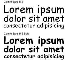
I mean, look at the little guy:
Sans serif, relatively even spacing, legible even when extremely small, and even just a little bit fun. And, look, here's a bonus for web developers: it's one of 15 legible fonts guaranteed to be installed on any Windows or Mac machine that anyone could possibly be using to visit a website. I'm no typography wizard, but I'd say those are pretty decent stats for a font. (Apparently typographers do quibble about the kerning and weighting, but they're not real people anyway. [/Joke])
Sure, I can understand how people might not like the look of it - I'm usually not terribly fond of it myself - but, believe it or not, there are people who hate the oft-celebrated Helvetica.
So, why is Comic Sans discussed with such disgust? After a few Google searches and a perusal of the Wikipedia entry for Comic Sans, I've discovered that the most-cited reason is because the font is seen as being trite, overused, and cliche. As the Boston Pheonix article cited on Wikipedia explains, "It's used everywhere: on fliers, on fax cover sheets, on signs of every shape and size. And Indianapolis graphic designers Dave and Holly Combs have had just about enough of it."
Again, this doesn't make a lot of sense. People hate the font because it's cliche and overused, but one can infer from it's cliche status that lots of people actually really like it. So ... lots of people really hate it simply because lots of other people really like it.
Oh. On second thought, that actually does make sense.
--
Edit: Someone shared this Imagined Monologue from Comic Sans with me, and it's absolutely hilarious. You should read it (but not at work).
And if you think I'm kidding or being facetious, there is even a website called Ban Comic Sans. Browse that website for a moment and you'll think Darth Vader himself is looming behind it somewhere, harnessing all the hatred for the Dark Side.
 |
| Use Comic Sans. I dare you. (Thanks Stuckon.co.uk) |
Yes, I know, I'm probably going to be blacklisted from every UX job for the next two years just for asking the question, but I seriously don't quite understand this level of hatred for, of all things, a gods damned font. It just doesn't make any sense.
I mean, look at the little guy:
 |
| Love me :( |
Sure, I can understand how people might not like the look of it - I'm usually not terribly fond of it myself - but, believe it or not, there are people who hate the oft-celebrated Helvetica.
 |
| It's a love/hate thing. (Thanks Typophile.com) |
Again, this doesn't make a lot of sense. People hate the font because it's cliche and overused, but one can infer from it's cliche status that lots of people actually really like it. So ... lots of people really hate it simply because lots of other people really like it.
Oh. On second thought, that actually does make sense.
--
Edit: Someone shared this Imagined Monologue from Comic Sans with me, and it's absolutely hilarious. You should read it (but not at work).
Thursday, September 2, 2010
Spectacle
One of the best parts about our technology-capable world is the vast wells of possibility it generates. And yet, for all that possibility, often there are little pockets of stagnation. Take web design, for example. At times it feels almost rote, like there is no ingenuity out there, like every site looks the same as the next. This isn't quite true, of course, but it can feel that way sometimes.
That's why it excites me when I find people who are on the bleeding edge of some of these technologies, pushing them further. What they come with isn't always practical - a lot of proof of concepts - but it can help expand the minds of designers and engineers who do make practical things. Perhaps someone will see exactly what they've needed to get a project off the ground, but could never quite figure out.
Anyway, without further adieu:
- Chrome Experiments - Fascinating and often spectacular experiments using JavaScript and/or HTML5. As is prominently displayed on the page, one of the experiments was done in conjunction with the flavor-of-the-month band Arcade Fire, an interactive film. I particularly enjoyed playing with the Color Piano and Magnetic.
- CSS Play - I discovered this site years ago, and re-discovered it just the other day. This guy, Stu Nicholls, manages to pull of stuff with CSS alone that most people can generally only do with JavaScript. Check out one of the fly-out menus to see what I mean.
Anyone know of any other great examples of envelope-pushers? I'd love to see them.
Song of the Moment: "The Infection"
"The Infection
I haven't quite figured out how I feel about the latest Disturbed album, but this song has got me absolutely hooked. It starts off with a riff as driving as it is uninspired (which somehow manages to come off as a good thing) and then breaks into Disturbed's secret weapon: Draiman's ability to croon out one hell of a melodic hook. The gutteral bark is what he's known for, but when he wants to Draiman can really sing. Something else that struck me about this song is that the biggest hook isn't in the chorus, but rather in the verse; that second line of the first stanza, where the vocals drop pitch, inviting the bass note to do the same. This is fairly unusual in radio-friendly fare, but I think this is an example of the reason why Disturbed are still selling out stadiums after a decade of producing music that never strays very far from the mark they set with Stupify
Subscribe to:
Posts (Atom)